My Houz
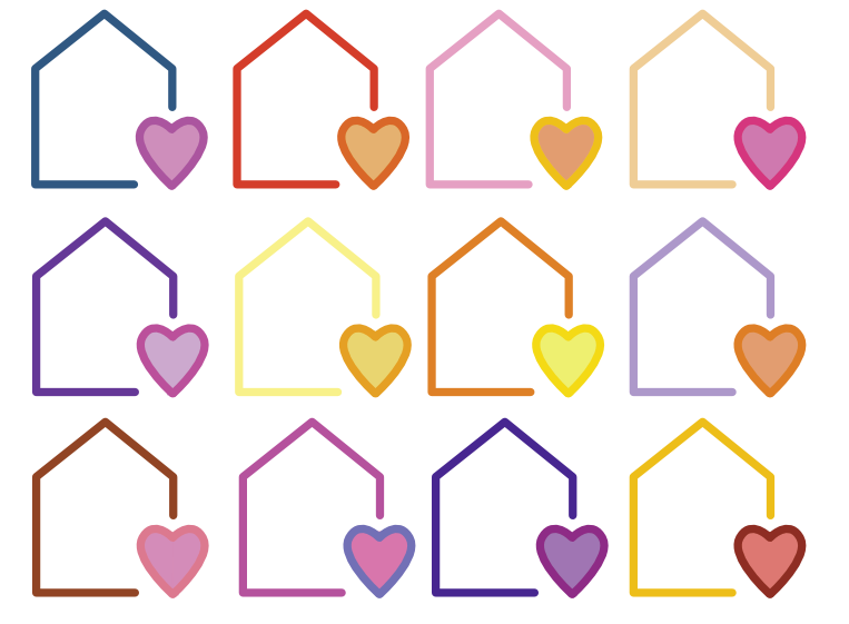
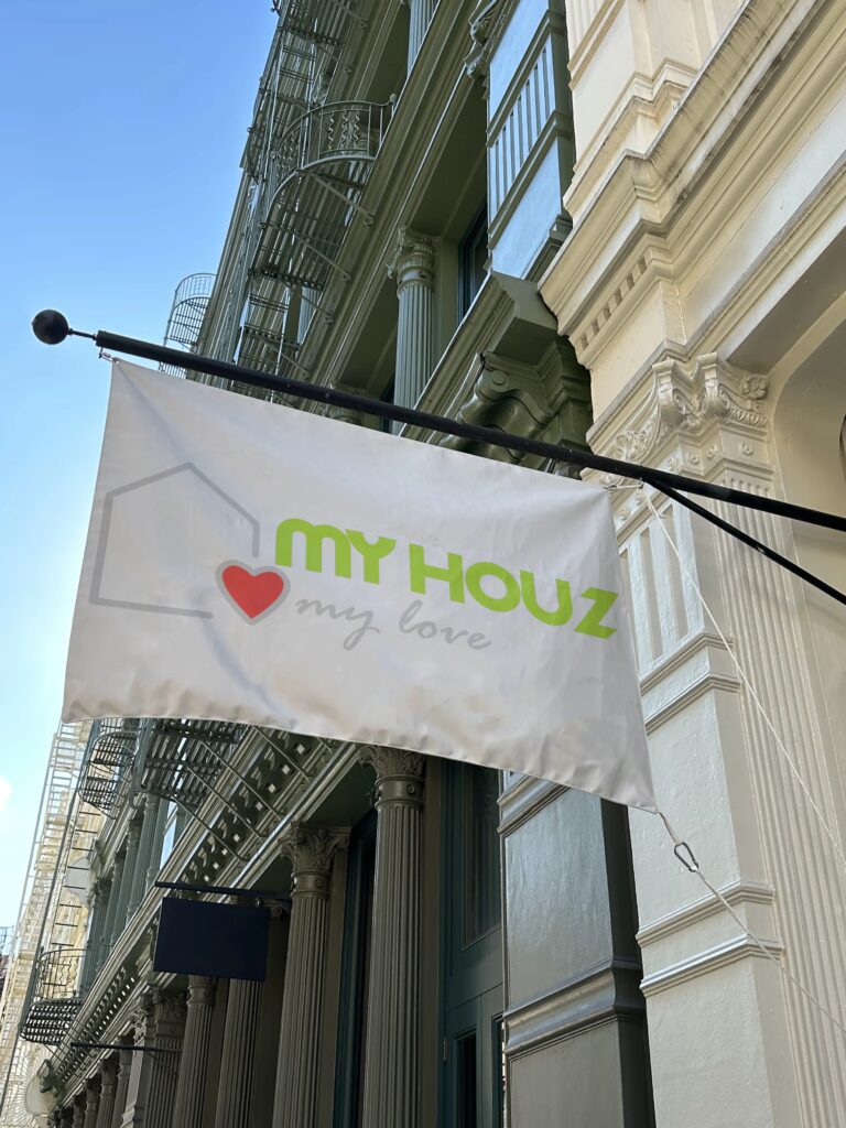
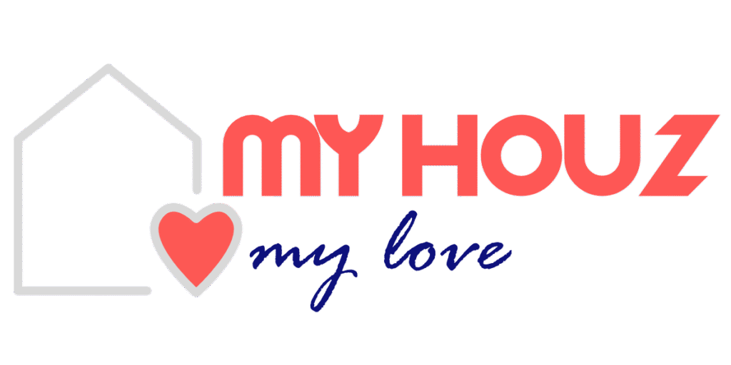
A real estate brand who wanted my services to redesign the logo that the owners didn’t like. they wanted a simple design that showed a related message through the design but also keeping the original colours of the first brand. First two images below show the primary design and a alternate design with a colour palette switch.
- Green, red and grey colour style
- A more curved version of the main typeface chosen in discussions
- A logo which followed the brand industry but also connects to the sub text.

Segoe Script
AaBbCcDdEeFfGgHhIiJjKkLlMmNnOoPpQqRrSsTtUuVvWwXxYyZz
